
The proliferation of big data, machine learning, and artificial intelligence (AI) applications in recent years has made us acutely aware of the potential of data science and data analytics. Image recognition, product recommendation, and fraud detection are just a few examples of today’s ubiquitous uses of data analytics.
Catastrophe modeling and the (re)insurance industry are no exceptions. AIR continues to harness unprecedented levels of data. Our atmospheric peril models (to give you just one example) leverage data on atmospheric, land, and oceanic climate variables, and we’re moving toward a new global atmospheric modeling framework whereby local models are unified by shared global data on atmospheric conditions. Beyond catastrophe modeling, our cyber and casualty risk solutions use high quality data not only to augment client exposure but also to understand how these threats can lead to insured losses.
The availability of big data will continue to unlock the potential of data analytics and extend the boundaries of what can be achieved. This is great news and we should continue along this path; however, at times like this, we should also remind ourselves of the importance of simple yet powerful ideas.
The “Datasaurus Dozen”
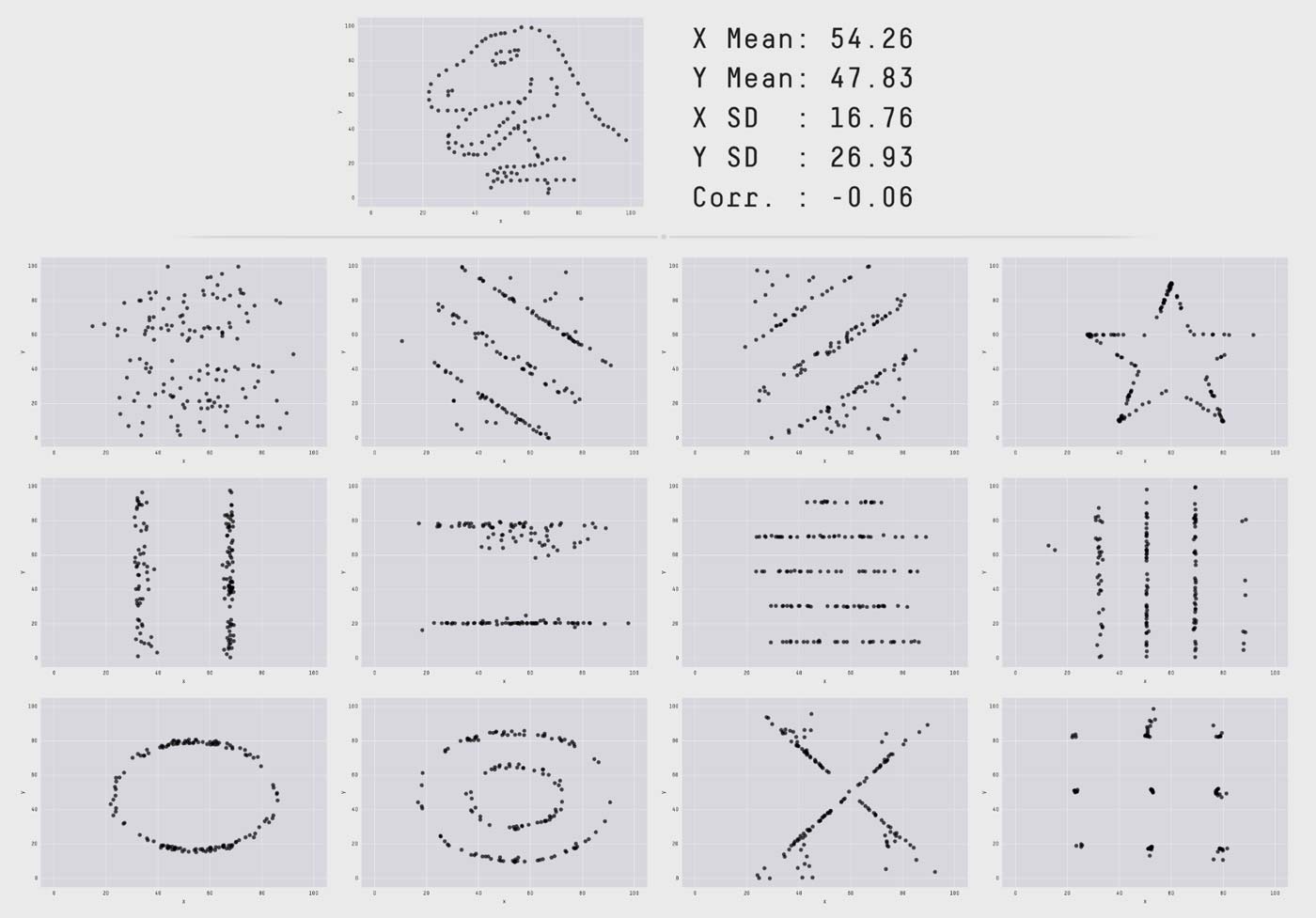
One of these basic reminders is the importance of visualizing your data. This idea was beautifully illustrated by Matejka and Fitzmaurice, who produced 12 data sets with identical summary statistics (mean, standard deviation, and Pearson's correlation) yet completely distinct plots (Figure 1). For a more dramatic effect, the authors configured their data sets so that they would also have the same statistics as the “Datasaurus” plot previously produced by Alberto Cairo to demonstrate that “normal looking” statistics can hide very peculiar patterns—in this case, a dinosaur!
Data Visualization in Catastrophe Modeling
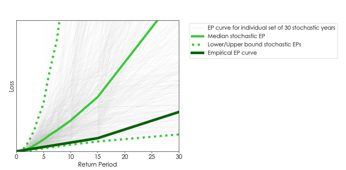
The example above reminded me of the importance of data visualization in catastrophe modeling. It is common for users of catastrophe models to compare stochastic results against the historical record of losses over a period. When doing so, it is useful to visually compare the empirical exceedance probability (EP) curve (derived from the historical loss record) against a comparable range of stochastic EP curves.1 For example, if we’re analyzing, say, 30 years of historical loss data, we can obtain a comparable range of stochastic EPs by randomly extracting many sets of 30 stochastic years from a 10,000-year stochastic catalog2 (as illustrated in Figure 2).
In Figure 2 we show an empirical EP curve (derived from 30 years’ worth of loss data) against 1,000 stochastic EP curves obtained from 1,000 samples of 30 stochastic years out a 10,000-year catalog. Because the empirical curve aligns closely to the lower bound of stochastic EP curves, one may be tempted to assume the model overestimates losses; however, this figure does not tell the whole story. Lower/upper bounds alone can be deceiving.
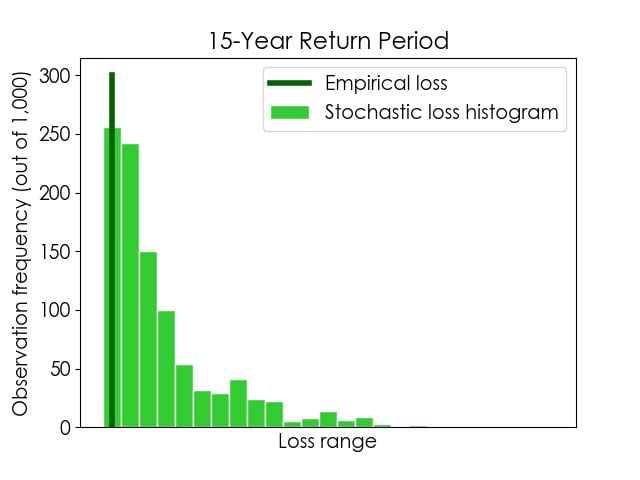
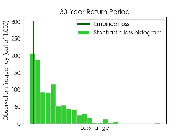
We should keep in mind that, in this example, we have 1,000 stochastic loss values for each return period (one per stochastic EP curve). Therefore, if we look closely into a given return period, we can plot not only the corresponding lower/upper bound of stochastic losses but, more importantly, how likely the possible losses within that range are.
This data visualization approach is illustrated in Figure 3, where histograms of stochastic losses for 15- and 30-year return periods are shown. The empirical losses for the same return periods are also indicated, for comparison. As in the plot in Figure 2, we can see that the empirical losses for these return periods align with stochastic lower bounds. In addition, the plot below shows us that the stochastic lower bound losses for these return periods are the most likely outcomes. This is a crucial finding—one we would have missed had we not pursued a more informative data visualization option—and it provides an entirely different perspective as to the robustness of the model and how it compares against the historical record.
The economist Ronald Coase once said that “if you torture the data long enough, it will confess to anything.” Let it be clear that’s not the point of this blog! Instead, I hope I have helped you appreciate that interpreting data and uncertainty is certainly about asking the right questions, but within the limits of what can be meaningfully be achieved.
Learn about Touchstone®: The AIR enterprise risk modeling platform
1 Please find more about interpreting the uncertainty in AIR’s stochastic results and EP curves in this AIR Current.
2 It is not reasonable to compare 10,000 years’ worth of stochastic loss results against 30 years of loss data. The reason being that 30 years’ worth of empirical losses provide an incomplete view of what next year could look like, whereas a stochastic catalog represents a comprehensive view of the possible peril activity over a future year (that is, after all, the main value proposition of catastrophe models). For additional details on bootstrapping uncertainty bounds, please see this blog.