Catastrophe model users often want to know how their modeled losses are affected by various factors, such as:
- Changes to their portfolio over time (for example, year over year or quarter to quarter)
- Changes in the models themselves (for example, from one version of Touchstone® to another)
- Different loss analysis options (for example, demand surge or disaggregation on/off)
Previously, comparing one set of loss results to another involved a cumbersome, manual process performed outside of the software. Now, Touchstone 3.0 includes an exciting new feature-Comparative Analytics-that, when used in conjunction with detailed loss analysis, lets Touchstone do the work for you,quickly and efficiently.
A simple use case illustrates the point. Imagine that you are a cat analyst at ABC Insurance. You have been asked to quantify the impact of storm surge on hurricane losses for a Florida book. Specifically, data that need to be generated include:
- Comparison of Summary EPs
- Comparison of Annual EPs
- Event level comparison
- AALs at county and ZIP levels
- Nice to have: visualization of the data
The flowchart below shows how-using Microsoft Excel and SQLServer-you might have tackled two of the five items listed above(AAL at ZIP and county, Annual EP).
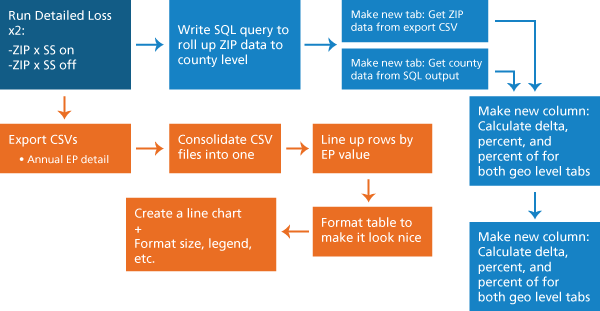
Necessary steps toward quantifying the impact of storm surge on a Florida book-before
the release of Touchstone 3.0
After a lot of manual work, you still have a way to go to complete the project.
With Touchstone 3.0's Comparative Analytics, you can cross off every item on the to-do list with a few clicks. Once detailed loss jobs are done, you simply need to opt in to view compared data at geography, contract, and line of business (LOB) levels. Touchstone will take it from there and deliver a gorgeously formatted deliverable in the Results window in no time!
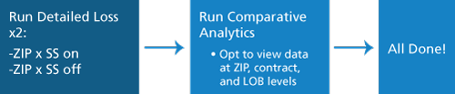
Performing the same task in Touchstone 3.0's Comparative Analytics
Comparative Analytics produces comprehensive charts, graphs, and a map that summarize the comparison results. In addition, it eliminates several data manipulation steps by providing the ability to roll up and drill down data to different geographical granularities on the fly.
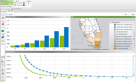
Data visualization in Touchstone 3.0. Results with storm surge are shown in blue and results without storm surge are shown in green. The map shows the difference in AAL by county.
Stay tuned for an upcoming training video on Comparative Analytics within the next few weeks, which will be released in theTraining Video section of the AIR ClientPortal.