The winter of 2015 (or more accurately, February 2015) has been historic for New England, setting many snowfall records and causing massive headaches for commuters in the Boston area. In addition to the heavy snowfall, February has featured extremely cold temperatures.
For those in New England, it may seem as if the cold must be everywhere, but in reality, while we have been enduring frigid conditions, western portions of the contiguous United States and even Alaska have been warmer than normal. This contrast is often the case-when the east is colder than normal, the west is warmer than normal, and vice-versa.
This type of pattern, shown in Figure 1, is characterized in the upper part of the atmosphere by a ridge of high pressure in the west and a trough of low pressure in the east. How much does this pattern differ from what we typically see at this time of year? By subtracting the climatological (average) conditions from the data shown in Figure 1, it is evident that the 500-mb geopotential heights are ~250 meters higher than normal over Alaska and ~450 meters lower than normal over New England, as shown in Figure 2. In other words, the ridge out west and the trough in the east are both quite strong-in fact, height values over New England are ~3 standard deviations below climatology. Once established, this pattern can stubbornly remain in place for days or weeks on end, as has been the case recently.
Closer to the surface, it is evident that temperatures over Alaska are actually warmer than those found over much of New England (Figure 3). Again, how is this different than normal?Underneath the anomalous ridge, temperatures in Alaska are up to 10°C warmer than normal, while over New England where a deep trough is in place there is a large area where temperatures are more than 20°C cooler than normal (Figure 4).
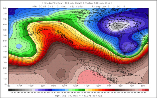
Figure 1: Global Forecast System (GFS) 18-hour forecast, valid February 20 at 06:00 UTC, of 500-mb height (shaded, in m). Higher heights indicate the presence of a ridge, while lower heights indicate the presence of a trough. This type of pattern has been present for much of the latter half of February.
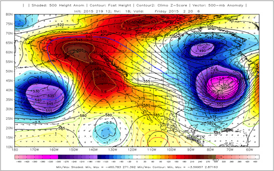
Figure 2: As in Figure 1 but the 500-mb height anomaly, which is the height values from Figure 1 minus the climatological mean height values from an atmospheric reanalysis data set (CFSR). Removing the climatological values allows us to see where conditions deviate substantially from normal. Cool (warm) colors indicate lower (higher) heights than are typically observed.
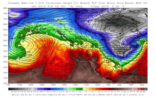
Figure 3: Global Forecast System (GFS) 18-hour forecast, valid February 20 at 06:00 UTC, of temperature at the 850-mb pressure level (shaded, in Celsius).
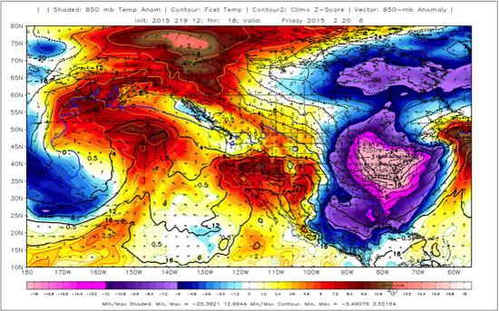
Figure 4: 850-mb temperature anomaly relative to climatology. Cool(warm) colors indicate cooler (warmer) temperatures than are typically observed.
These (and other) maps got me thinking that for the time being,I would rather be in Anchorage, Alaska, than Boston, Massachusetts! For the month of February, climatological temperatures are gradually increasing in both of these cities as we pull away from the winter solstice, with an average high/low of 27/14°F for Anchorage and 39/25°F for Boston. Therefore, from a climatological perspective Boston should be approximately 11° warmer than Anchorage on average.
Looking a little more closely at February 2015, the top panel of Figure 5 shows the daily mean temperatures for the first 25 days of the month. Consistent with the previous discussion, there is a distinct inverse correlation between temperatures in these two locations, with the first 10 days of the month being warmer in Boston, prior to a reversal as the ridge in the west and the trough in the east became established.
Looking at the running daily mean temperatures (Figure 5, bottom panel), after a cold start, Anchorage has caught up and surpassed Boston: The average temperature for the month in Anchorage is 23.2°F versus 19.0°F in Boston. Based on current forecasts through the end of the month, this difference will slightly increase,assuring that Anchorage has a warmer average February temperature than Boston. Based on the past 42 years of Global Summary of the Day (GSOD) data, the monthly mean temperature in Anchorage has been warmer than that in Boston twice in February and 4 times in January, so while this is a rare occurrence, it is not without precedent.
Relative to each city's normal temperatures, Anchorage has been warm while Boston has been very cold; through February 25 Anchorage is ~2.8°F warmer than normal while Boston is 12.4°F cooler than normal (Figure 6)! The month of February will certainly be one for the record books in Boston, while for Anchorage it will go down as slightly above average.
I for one, am ready for Spring!
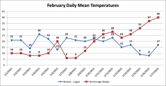
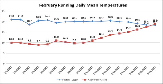
Figure 5: Top panel: daily mean temperatures for Boston (Logan Airport) and Anchorage (Merrill Field Airport). Bottom panel: running daily temperatures.
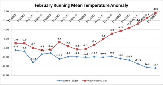
Figure 6: Running mean temperature anomaly for Boston and Anchorage.
See Tim Doggett, AIR Senior Principal Scientist, talk about the "brutal" northeastern temperatures in February 2015 and the damage that snow accumulations can cause.