From my experience of explaining the concepts of catastrophe modeling, I've found that the ones associated with mathematics—and particularly with probability—are more difficult for audiences to grasp compared with, say, the scientific concepts associated with hurricanes and earthquakes.
I've long tried to figure out why it is that hazards are more easily understood than probability. Perhaps it is related to the binary buckets that people often place themselves into—"good at math" or "not good at math."
I'm beginning to think, however, that the aversion to mathematics and probability could be partly blamed on probability being so difficult to envision. From countless disaster movies, it may be easy to picture yourself in a hurricane with roofs being ripped off buildings, in a flood watching waters rise, or in an earthquake experiencing ground shaking and collapsing buildings. It's much more difficult to imagine yourself within a probability distribution!
The closest I've come to this was the thought experiment I heard a statistician from Oxford University give some years ago. He asked us to imagine multiple parallel realizations of a region's weather experience—for example, 200 parallel years of hurricane experience in which some years might see many storms, and others none at all. The year resulting in the highest loss represents the 200-year aggregate loss.
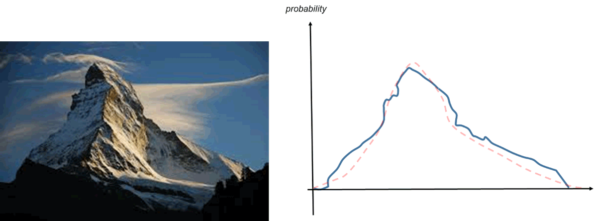
While trying to make it easier for people to relate like this, I realized that probability distributions can also have an aesthetic appeal. Here's something you probably don't hear often: probability can be beautiful. Take the Matterhorn in the Swiss Alps, for example. Its form is iconic and beloved by courageous mountaineers, but viewed by a statistician this same shape can be interpreted as a unimodal probability distribution with a longer right tail than left (at least, seen from the southwest as in the image in Figure 1). Looked at this way, probability doesn't have to be abstract, and when graphed it can be more widely appreciated and understood.
Probability distributions are used to describe the uncertainty in loss given the uncertainty in modeling each location and event exactly. They give the likelihood of a loss being in a particular range, such as a 20% probability that location 1 has a loss of USD 1–1.5 million from event 5. At AIR, we use probability distributions of several different shapes to represent the way losses can vary, including bi-beta, transform beta, and truncated gamma. For any given peril, the shape of the probability distribution varies with mean damage ratio.
In Touchstone®, probability distributions are produced for individual locations and coverages by event, which need to be combined (via a process called convolution) to give the probability distribution of the losses for, say, location 1 and location 2. Interestingly, this convolution process can sometimes give unintuitive results. It took me some time to wrap my head around the concept that combining two flat distributions can create a peaked one.
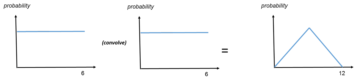
Let's take the example of a single die. The probability of rolling any given number (1 through 6) is always the same—one sixth—a flat distribution. But when rolling two dice, the probability of getting a 7 is greater than the probability of rolling a 2 or a 12. This leads to the peaked distribution shown above.
This convolution process is used at AIR to combine loss distributions to obtain the combined distribution of loss for multiple locations impacted by an event. AIR is working to update its financial module in the coming years and will be enhancing the algorithms—including convolution—and the underlying probability distributions used. Expect more blog posts on the financial module and uncertainty as we move toward AIR's Next Generation Financial Module!